Interview with Ed Benguiat
Back in 1999, while in New York, I had the pleasure of studying Typeface Design at the School of Visual Arts with Edward Benguiat, a design legend and a true character. A few months after the class, my colleague and friend Trudy Schnitzler and I interviewed him for Box, an Argentinian design magazine.
Ed Benguiat passed away on October 15th 2020 aged 92. He was a great influence on me as a person, as a designer and, years later, as a teacher. His classes were an incredible mix of design and personal stories. He was bright, funny, humble and accessible. We met twice for the interview at a pub (Bull's Head Tavern?) near SVA and he was as passionate as he was in class. A very generous person that shared his immense knowledge in a practical and fun way. Thank you Ed. It was an honour meeting you. And thank you for the xmas card!
Here is the interview.
New York, NY, November 1999To start this interview, a bit of history first: where did you study?
At a place called The Workshop School. When you got out of the Army, the government said you could go to wherever you want, and they will pay fo it. If you wanted to take Tap Lessons, take them, take anything you want. So I went to The Workshop School, and I’ll give you some anecdotes: the teacher said to me, I was taking illustration, with a naked lady in the room, and you’re not supposed to look at the paper, just look at the girl and draw, and the teacher said to me “I think you should get out of the art field as quickly as possible” because I can’t draw, so I took Production, Calligraphy… and I saw the same teacher, I forgot his name, right here at the School of Visual Arts, and he told me, 40 years ago or whatever, to get out. So I went over to him, and I said “I don’t know if you remember me, my name is Ed Benguiat…”, I was going to tell him all, and he said “Oh I know you, I use your work all the time…”; I didn’t have the nerve to tell him, but I was very thrilled… what goes around comes around…
Did you always know that you wanted to be a graphic designer?
I didn’t know what I wanted… I was a musician! And when I went for work one night, I had to get there around 8 o’clock, there were a sign in front of the school, Art School, it said “Be an Artist” and it showed a picture of something like a chicken or whatever, or an indian, and I said “I’d like to be an artist, and I’ll paint ladies, and I’ll have a beautiful home in Wesport, Connecticut, and I’ll draw, and I’ll become like (Alberto) Vargas or (George) Petty” and that was very disappointing, but I did go to the school, I didn’t know what I was looking, all I knew was that they had lettering, calligraphy, production, Illustration, Painting, all the courses and you can take them all, so what I used to do was, I would started school at 12 o’clock, stay there until 9, and then go to work as a musician around the corner. I did this for a year. But I didn’t know was I was going to be… I think that I could say that I figured when I got my first job “I can do anything, ANYTHING!: Mechanicals, paste ups, Illustrations, paintings, anything that I can trace” and one day, the Letterer, I was in this publishing company, was home sick, and the Art Director said “I need this lettering”, so it was a matter of tracing type or tracing a sketch, and the next day he said to me “how would you try with some retouching” so I became, this is an unbelievable story… my first job was a cleavage retoucher, to take out the cleavage of girls, movie actresses, because there was a company called The Haze Office, you could not show a breast of a woman, there were no Playboy, only one magazine, Nudity or National Geographic showing the naked women. So I use an airbrush to cleavage, and sometimes, I would go to the 5 and 10, black and white prints, and glue bits, where the airbrush stops, glue bits and then pasted on the photographs, and then you make a copy of the photograph. So, my first job for a year, was taking out the cleavage. (…) And now they put it back! It’s unbelievable what they do now!
And that was always here in New York City…
Always in New York

Did you continue your career at an agency?
No, my first jobs was magazines. The names of the magazines were Movie Magazines and Romance Magazines. In those days women would read romance magazines, like True Romance, True Story, True Confession, True Love. And the movie magazines were Movies, Movie Stars Parades, Movie Life, Photo Play, this is all one company that own all of this, and I just worked, doing all the magazines.
When did you start with typefaces?
When I had a studio. My first creation of a typeface was when I got a job from a company called Schering Pharmaceuticals, and they wanted maps. The maps were 6 feet high by maybe 4 feet wide. Of all the states, some places were two states, like Vermont and New Hampshire, Connecticut and Rhode Island, etc. And there were lettering on each area to signify medical universities, like Columbia Medical Institute, like Boston School of Medicine, and they needed, we use to hire, a calligrapher to do it. No, I said, that will cost me too much money.Then I made the whole alphabet, and I have my, when we kids, just paste the words up in negatives, and once you paste them you take black ink and you take out the cut marks, and then make a print, so they will do that, and then I said “hey, it’s not a bad alphabet, I’ll give it to Photo Lettering, so now I can call up and they’ll set the type and i bill the client”. So that was the first job of a calligraphic alphabet. The second one, after I gave the alphabet to Photo Lettering, a man who own Photo Lettering, the president, asked me if I’d like to do a typeface for The Ford Motor Company, for trucks. I used a Futura jumpy, and a thick outline, very ugly, I used a speedball pen and clean out the points, and that was the first typeface in print. Then The Ford Motor Company said “we like this guy, maybe he can do a typeface script for Lincoln cars, so there were another designer who I don’t want to mention, who was doing it, but it started to shake. So I copy pretty much what he did and updated it, (…) so that was the first alphabet.
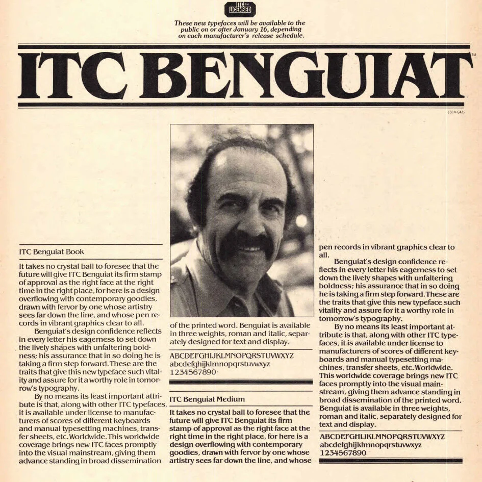
When did you create the Benguiat typeface?
Let me figure it out. I worked at Photo Lettering creating typefaces for them. My studio, which had 21 employees, it was called “Associates Benguiat and Co”, “abc”; we had a beautiful logo and we sold the logo to American Broadcasting Company. And if you look careful, it looks like it said “doc”, because the “b” was part of the “a”, that’s why it looks like “doc”. And then we had two accounts: Westinghouse and General Electric. Hot! For a studio… and they’re both had the same kind of advertising, with a lady holding a florescent bulb… And the art director who gave us the work, I won’t mention the agency or his name, he used to give us the work, and we would pay him; you know, pay off. We would write a check but we would market it our books as whatever, but we would never say it was a gift. One day they lost the General Electric account, he was handling that, so we would going to lose the account and he was being paid off by a lot of people, under the table, and he went into the subway to go home and took a gun, boom, and blew his head off, because his son, his family were living very rich, and then that stopped. So we lost General Electric and when it got out, what happens, our name came up, and we lost Westinghouse. So now I was out of business.
If you have two accounts, that’s all you need, but you’d better have a lot of little ones, that what Herb Lubalin did, lots of little accounts. Blah blah blah.
“hey, look at me, I’m all alone here baby, you want to use me? Find a word with it…”
Now I was out of the job, I owe everybody money, my partner and I, and Ed Ronthaler from Photo Lettering, give me while I was up to here, I owed alimony, I owed art supply stores, I owed restaurants, rent and we didn’t file bankruptcy but we paid everybody and we promised to paid them all, we did, little by little, we didn’t stop using the art supply store and we told them, we don’t have the money but we’ll pay you little by little, we don’t walk away and let you think that we’re not going to pay you. So we paid them and then one day Ed say “would you like a job?”, and he gave me a job, he paid all my bank alimony, and never wanted a penny back. Never. So that was the beginning, drawing alphabets for Photo Lettering, to create booklets and make alphabet popular; pop-art, psychedelic art, victorian graphics, so then you put all the typefaces in little booklets, and then I made a big fat book, like a telephone book, and that was the beginning. Now, one day, a man came over to me, from Hallmark and he said to me “can you put an alphabet on the Alpha Type Machine?” Alfa Type had a grid so big, I think was 5 by 7 (inches) and the alphabet was all in there in negative, and it push it into the machine, and it’s not “abcde”; the popular letters are in the middle, so that the machine doesn’t have to search. So he came to me and ask “how long can you put an alphabet on this machine?”. So I said “I’d like to think about it”, so what I did was I took this grid and I blew it up ten times, it was the beginning of ITC, I blew it up as big as this table, and I looked to see how Helvetica was. So when I blew it up I had a positive, and I put wax on the positive, put it on a film and wherever the “a” was, in the same position, I put Franklin Gothic, which almost looked the same thing, and I pasted in the same spot. All the way and then I made a negative again by reducing it down 10 times, and then we put it in the … and keyboard it. And it looks good; a little crooked, the spacing wasn’t so good, but we fixed that, because I go back to the original and move it to the left, to the right, until I got it. And that took about 2 days, 3 days of hard work. Then I called up the man and I said, “yes, we can put an alphabet on the alpha type”. “How long will it take?” I said “24 working hours”. So he gave me a very nice alphabet and he wanted for greeting cards and I put it on and then Aaron Burns and Ed Ronthaler and Herb Lubalin, who I was very friendly with, said “that’s a great thing!, you can put an alphabet on this machine?” I said “yes”; “any alphabet?”, “any alphabet”. Well, that was the beginning of ITC, and the first alphabet was Avant Garde. Then we found out that when it get small it closed up, so we create one version for small size and one for big size. That was the beginning. And then Herb had 26 alphabets, that Tom Carnasse did, and with the copy that I wrote “26 good reasons (26 letters) to use…” Avant Garde, Serif Gothic, Bookman, etc.
Anyway, that was the beginning and then Aaron said “how are we going to sell this?” and Herb Lubalin said “we’re not going to sell alphabets, we are a foundry; we’re going to design and give them away” and Aaron Burns said “give them away?” he said “yes, we’re going to give them away, for free; this way nobody steals it; but, the companies that we give it to will put it on the Alpha Type grid” and then, a new machine came out called “8600” from Compugraphics and everytime they sell a disk to somebody who has their machine, they’ll pays us a royalty. So we call this people “subscribers”. We had subscribers, going all the way from California to New York. Sometimes you bought the machine and you got 5 typefaces with the equipment. So, that was a good idea, and eventually, the company grew and grew, until recently, a bad management cause the company to be taken away. Because from Herb Lubalin and Aaron Burns, who own the company (I have only a 3% of the company) run the company, there were good designers, woking on U&lc; you had Milton Glaser, Lou Dorfsman and a lot of “hip” people, and they knew how to do it, they knew how to show type. Well, eventually, Letraset bought it.
And then came your typeface…
I don’t know. 25 years ago?
Was it made with a specific purpose?
No, it was for a friend of mine who wanted his logo. He hated it: “too much like a swastika” HE were his initials. So he hated and I like it. So I made an alphabet of it, first I did the word “hamburgefonts”, I liked it, Herb liked it, and we put the whole alphabet together, and we had a meeting to try to move it, but no one liked it. Aaron Burns said “no, it’s too ethnic looking; it’s the kind of font you use for a Bar Mitzvah or for a confirmation, so they didn’t accept it. I was not committed at the meeting, the artist is never permitted at the meeting and they always call him a guest. So I wait for a while and then I submitted again. Still nobody liked it. And then Herb said “do the alphabet” (we only had the word “hamburgefonts”) so I did the alphabet and Herb said “we’ll use it” and I put it on the grid, because we had an old Alpha Type Machine, and Herb used it for all of his bookjackets: “The Bible”, “I found Eichmann”, “Jewish Cooking”, “How to believe in God” and then menues, and logos, and then, when we showed it the next time Aaron said “it’s not bad, it’s different, I’ve never saw a typeface like that”; and then I’ve never could name the face, I wanted to name it after a friend of mine who passed away, and Aaron said “no, we’ll find a name” and then Herb said “call it Benguiat, you got a Lubalin, haven’t you, call it Benguiat” and they did; and it took of, like wild fire; every place was using it. But you see what happened was, I’ve made a mistake. You should never build obsolescence into a typeface: if you put out a typeface no matter what it is, and you put out another one that has the same feeling, the one that you did will die. That’s why the Volkswagen was so succesful, nobody could see the difference between the old one and the new one. I did Korinna; and Korinna feels like Benguiat. So therefore, everybody start using Korinna, and they move that out. Then there’s other, like Tifanny. Tifanny is a combination of Caslon and Wilkinson. Aaron Burns wanted me to re do Wilkinson. Herb Lubalin said “Wilkinson is shit; why don’t you take a little bit of Caslon and throw it into Wilkinson” and it end up with tities all over the place. The public went crazy. Then there’s other one: Benguiat Gothic. The most popular typeface was Bookman
When you look back on your career, are you happy with all of the typefaces you designed?
I don’t like anything I’ve ever did. I’m happy with what I did, but I will like to do it all over again. If you don’t realized that you made this errors; they’re not really big errors…
I’m not trying to compare myself to Michelangelo or Da Vinci, but I’m sure that when he finished the sistine chapel, he would have ripped everything off and started all over again. I’m sure that when he was finished he said “oh, I should have fix this, change that” etc. Well, I’m saying the same thing, because an artist is never happy with what he did unless is mathematics.
We know there’s a letter that you never use. Could you share which one and why?
The “w”. Because it was a girl called Wendy, I was in love with her, she lived with me for quite a while, she got married, she has a child, she’s very happy… I promised myself that this love that I have in my hearth will be shown by never using a “w”. Any headline with the “w” I wouldn’t do it. And to this day, when I’m designing something typographically, I leave the “w” out. Always. If I show the whole alphabet, I leave the “W” out.
And you love the Q, right?
I love the Q. I feel that the Q is gorgeous. It is really beautiful. It’s the only letter that has two letters: & and Q. It’s like saying “hey, look at me, I’m all alone here baby, you want to use me? Find a word with it…” and you can’t find a word with it! In U&lc one time, Herb Lubalin did a whole page of Ed Benguiat’s ampersands. The whole thing with ampersands, and he said “this man is sick with ampersands”. But the Q is beautiful, doesn’t matter how you make it, it’s always good.
Do you consider that typefaces which are “legible” are actually legible or, is it because the eye just gets accustomed to them?
There’s two different things: readability and legibility. Legibility means you can just see it, readability that you can read it. For example, if you design a wedding announcement: you wouldn’t use a readable letter; you would use a script, something fancy, so you can’t really read it, you have to struggle. It’s legible, you can see it, but you can’t read it too well. If you want to read it, you use century. I think the answer to what you said is it because you’re use to it; I think that when we were in school, in the US, the children learn to read to print “Futura”, but the first book is not Futura, the first book that they read is Century Schoolbook and they get very confused. Little billy doesn’t know what this is, he never saw it before. That’s why they can’t read. Then they came older and get used to it. So, there was a man called, I believe, Dwiggins, who sold the United States Bill of Goods, that the name of the typeface to read the best would be Century Schoolbook, so they put it in all the books. So now we are used to reading it because that what’s we were taught in school. To an average person, Century Schoolbook or Garamond, they look the same. To your mother, they look the same. Bodoni and Caslon, they look the same. The only one where they can see the difference is cooper black or Hobo, one of those funny letter. So therefore, our society is reading well because they are use to it; now it’s the world of sans serifs, and that’s not easy to read, because it doesn’t have little parts, that you can recognize, it like monotone, but we don’t look at that typeface as a designer to be readable, we want them to be legible and pretty: it looks nice. They don’t care whether you can read it or not. So, reading a page it has two things: the first thing is you want to read it, so you read it no matter what type it is; the second one is high readability and legibility: you recognize it, you see it, but you read from the top of the letters. Readability is what we learn and what we are used to and legibility is something we just like to look at. Whatever you design, in a tricky style, you can’t read it at all. I did a think for someone a long time ago and he said “I told you to make it beautiful”, “well, it is beautiful”, “yes, but you can’t read it” “ok, if you want it readable put it in century schoolbook” You’re not supposed to read it. Like the ITC logo, all in scripts. You can’t read that. And who reads it anyway? Design is never read, it just look at it “that’s nice”.

What is your advice to design students?
My advice for new designers and students is to start looking at what others have done. I would say, if you’re into typography, take a look at Paula Scher’s work. Keep looking at it and let it rub into you. And maybe even, start copying the faces she uses. Maybe how she uses it. There’s nothing wrong in copying; I don’t mean steal it, because you’re never going to steal her, because if she’s doing an ad for a broadway show and you’re doing an ad for whisky you can’t convert her feeling into the whisky ad. There’s nothing wrong in having a mentor, that doesn’t know you’re there. If you have a mentor who’s a designer, do everything he does, stay with him! Even in music, musicians like to copy what other musicians did. Now, if you copy long enough, eventually you’re going to go like this on the band stand; you’re going to hand out music to the musicians in the band, and the next thing you know, it hit the charts! And then your band will become the group that other people imitate. That how it starts. You’ve got to follow the ones that are good

Ephram Edward Benguiat (October 27, 1927 – October 15, 2020) was an American typographer and lettering artist. He crafted over 600 typeface designs including Tiffany, Bookman, Panache, Souvenir, Edwardian Script, and the eponymous Benguiat and Benguiat Gothic.
He was also known for his designs or redesigns of the logotypes for Esquire, The New York Times, Playboy, McCall’s, Reader’s Digest, Photography, Look, Sports Illustrated, The Star-Ledger, The San Diego Tribune, AT&T, A&E, Coke, Estée Lauder, Ford, and others. Other notable examples of Benguiat’s work are the logotypes for the original Planet of the Apes film, Super Fly and The Guns of Navarone, and the typeface for the opening credits for Stranger Things (source, Wikipedia)